Get to Know…Peter Dunham, Hollywood at Home
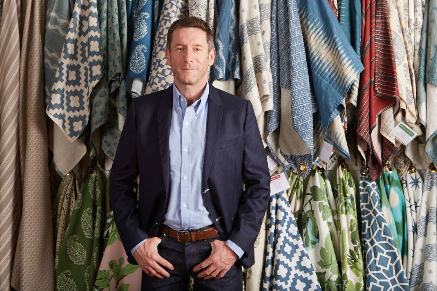
Six, eight, let’s say 10,” designer and Hollywood at Home owner and famed designer Peter Dunham answers when asked how many prints he’s used in a room. “I’d probably use 20 though.”
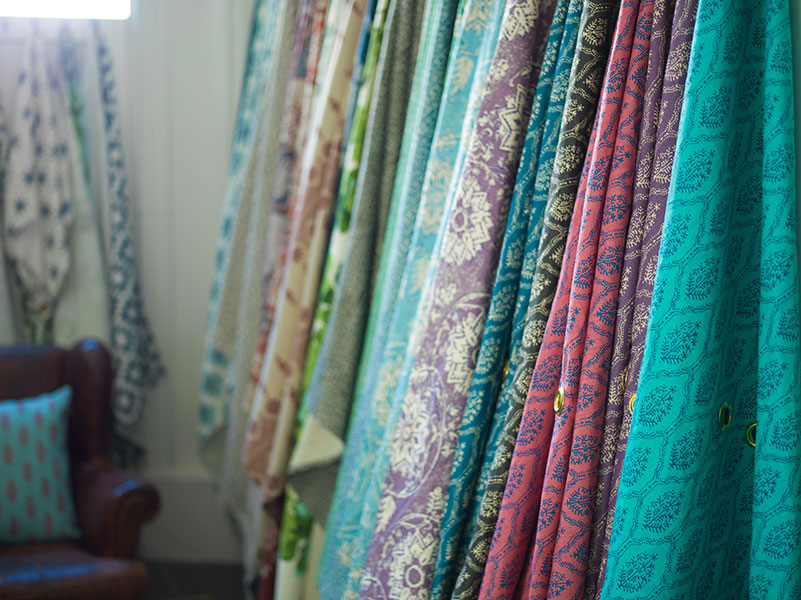
No surprise given the endless rows of stylish textiles at his (and anyone’s) fingertips at his captivating shop in the heart of LCDQ.
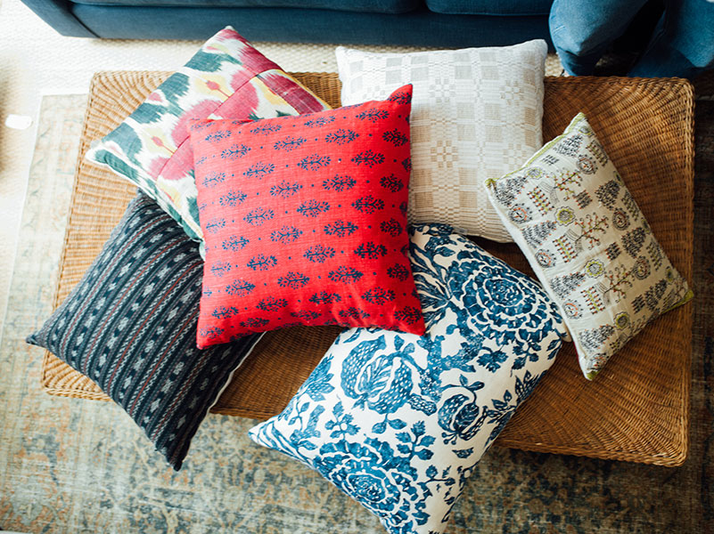
Dunham is known for carrying some of the most sought-after print fabrics and wallpapers including Carolina Irving, Lisa Fine, Schuyler Samperton, Peter Fasano, Penny Morrison, Elizabeth Hamilton, Lake August, VOUTSA, and of course his own eponymous line.
To Dunham, pattern is a key component of design. “If you think of an interior as a piece of music, the prints are part of the orchestra,” he says. “The notes can be modernist, traditional, tribal. They have a visual rhythm and tell a narrative. They excite the eye and enliven the space.”
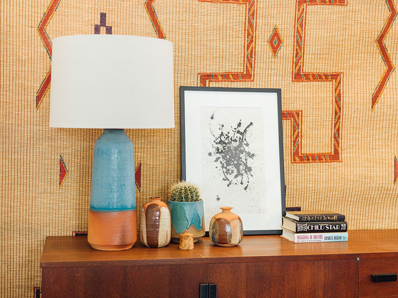
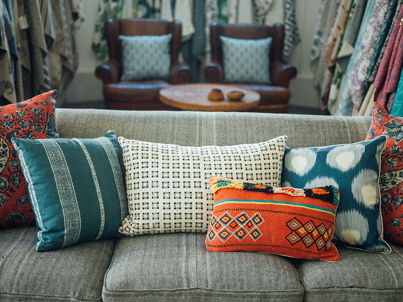
Inside the store’s 4,500-square feet, warm, well-appointed “rooms” are indeed singing with pattern alongside vintage and custom furniture, lighting, artwork and artisanal accessories including Dunham’s own Hollywood at Home collection.
So how did this Prince of Prints, an Englishman reared in Paris and Spain, end up Los Angeles?
The journey began with a school chum, designer Ashley Hicks, son of the iconic English decorator, David Hicks. “I always referred to David a bit as the James Bond of interior design,” says Dunham, sitting on a sofa in his shop bedecked with (what else) colorful patterned pillows. “He had his incredible suits and these crisp, cool interiors. Until then, I had never really been exposed to interior design.”
Hicks too made a name for himself embracing bright, bold pattern. “He created the geometric revolution in a huge way, which is still very strong today,” he says. The elder Hicks became a mentor to Dunham but it would take time before he united his passion with his profession.
After attending Oxford (and interning under Hicks), Dunham pursued a career in real estate in Manhattan where he was equally adept at closing a sale and helping clients decorate their new homes. After his own apartment appeared in Elle Décor, it was clear his focus would turn from escrow to interiors.
“I became a designer as a second career when I moved to L.A. in 1998,” Dunham explains. “I had always been interested in textiles, buying them on my trips to India, Egypt, North Arica.”
Quickly landing design jobs for high-profile clients like Jennifer Garner and putting his unique imprint on homes of his own, a look dubbed “Merchant Ivory Moderne.”
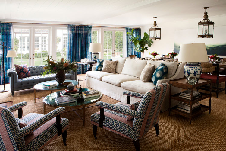
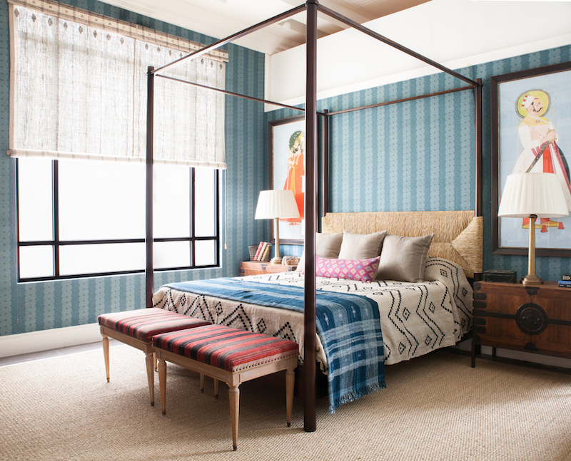
His signature is an effortless mix of color and pattern, vintage and contemporary. It has the feel of a fun-loving eccentric aristocrat on holiday.
Dunham got into the textile game when he couldn’t find what he was looking for.
“I’m a bit of a lazy shopper, so I started making the things I wanted,” he says.
Peter Dunham Textiles was born and became a signature of his growing design business. Then and now, his vibrant, refined, and charming prints blend European elegance with casual California style.
“I’ve always been interested in the more organic geometric shapes,” he says of his own line. “I want to celebrate anything hand made whenever I can. I’m not going for a polished, laser-print kind of look, more of an oil painting,”
In 2007, Dunham was looking for a space to hold his design business and his growing textile collection. He set up shop in Almont Yard neighboring with L.A. designers Nathan Turner and Kathryn Ireland.
Ever since opening the doors, he’s featured the work of friends and fellow designers alongside his own. And the fabric showroom is a print lover’s playground with fabrics and wallpapers to suit any style, subdued to spirited.
Moving to his current space on La Cienega Boulevard in 2015, Dunham now showcases an ever-growing mix of printed textiles and wallpaper, custom furniture, artwork, and handmade accessories.
The design trifecta seems fated given his earliest influence. “It’s just like David Hicks,” says Dunham. “He had stores, he had furniture, and he had prints. It was all part of his dialogue.”
Peter Dunham on Embracing Print & Pattern
Prints tell a story…
“Prints have a narrative. They quickly establish something about the person living in the space. A bold black-and- white stripe may say, I’m a modernist. I like order. Whereas an African pattern reveals a wanderlust, a Bohemian side.”
Prints are not to be feared…
“You can go subtle with print. When someone is pattern-averse, I suggest an outdoor performance woven made from Sunbrella yarns.” They’re more about structure of the pattern in the fabric. And so durable.”
Prints should not “match”…
“Reverting to a safe, matchy-matchy story is a mistake. It starts to look less interesting, and more like a ‘70s or ‘80s hotel.”
Prints like varying scale…
“I think large and small prints mix really well together. Try a bold stripe along with something more delicate or intricate.”
Prints are not a black or white issue…
“I don’t like too many light or dark backgrounds in the same story. It looks like they’re fighting. Pairing a dark and light print will feel more compatible, like a good cuddle.”
Prints love a bit of texture…
“Mix textures the way you mix pattern. It’s more interesting for the eye. If everything is the same fabric and shade, it all mushes.”
Prints make a connection…
“Pattern and color can be used to maximize what’s around them. It could be green to play up the nature outside or a blue to bring out the color of your eyes.”
Prints are personal…
“It’s a bit like clothes. What you find appealing is different from others. Go for what you like and you want to live with.”
Prints save a bad space…
“If you have a real wretch of a room… dark, lifeless, use pattern and color print all over the ceiling, the walls, the curtains. Even if the rest of your home is neutral. It creates this really special surprise.”
Hollywood at Home
703 N. La Cienega Blvd.
Los Angeles, CA 90069
T (310) 273-6200